Save the Children USA just premiered its “Most Important ‘Sexy’ Video” and it’s another excellent example of nonprofit YouTube marketing that’s thought-provoking entertainment. There aren’t any dazzling special effects or set pieces, just good old-fashioned social commentary wrapped up in Office-esque cringe-worthy charm.
You may remember the London-based Save the Children organization for their viral “Most Shocking Second a Day” video which has garnered over 30 million views since its publication, earning the distinction of being the 2nd-most shared ad during March 2014 from Unruly Media. The company’s American counterparts launched their own distinct piece that skewers luxury branded storytelling with human rights issues. The video even serves as a brief self-reflexive examination of the filmmaking process (if you’re into that academic analysis stuff). What can we learn from this gem?
Your Story’s “First Act” is Where Audiences Buy In
As you can see, several unsuspecting models are hired to pitch an unnamed but definitely sexy brand, ultimately falling for a switcheroo. Directors Josh Ruben and Vincent Peone need to establish a working frame in a timely manner so that the fauxcumentary narrative is understood by audiences; models being prepped with makeup and wardrobe, technical teams setting up lighting schemes and cameras, a director instructing the talent. A buzzing, bass-heavy audio track that sounds like the type of harmless dance music that so perfectly captures most high-end ads of this genre hums in the background. This behind-the-scenes staging gives us a more meaningful perspective on what’s about to happen because we’re in on the joke.
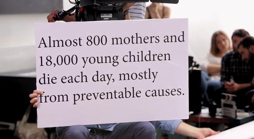
Even if we have no prior knowledge of anything, we can quickly understand the direction of this video after about 30 seconds. The cue cards begin shifting dramatically: “Almost 800 mothers and 18,000 young children die each day, mostly from preventable causes.” If I were to apply traditional screenwriting structure to this portion, I’d consider these cue card shenanigans to be the First Act climax which hooks viewers into the game and establishes the new rules of the world. This pivot point serves as the catalyst for our laughter and deep discomfort, allowing Save The Children to really begin articulating its message.
It’s All About the Reactions
The entire premise hinges on our reactions to the models’ reactions. These unscripted reactions have been viral video fodder for years. It’s the same appeal behind voyeuristic “gotcha” shows like Candid Camera or Punk‘d. Face it: we sometimes like watching other people squirm when they’re put in extraordinary circumstances. Ruben and Peone really capture the shock, confusion, and sense of fluster when these actors are blindsided by the words they’re reading. The director character provides a nice contrast by deadpanning advice that emphasizes more and more sexuality. Of course, this leads to a montage that defines awkward :
In a way, it’s about the exchange of information as the story progresses. We know something that the actors don’t which causes the friction that sparks the comedy. Great branded video content always understands this transaction when writing and convey story. Think of House of Cards. Frank Underwood is often a couple steps ahead of the audience in his schemes so we are perpetually in the dark until actions reveal something. However, we sometimes have a head-start on Frank and other characters because we possess crucial knowledge they lack which allows us to see the big picture. That disparity – and the reactions to the sudden influx of info – makes for great drama, great comedy, and great branded content.
Great Content Needs More Great Content
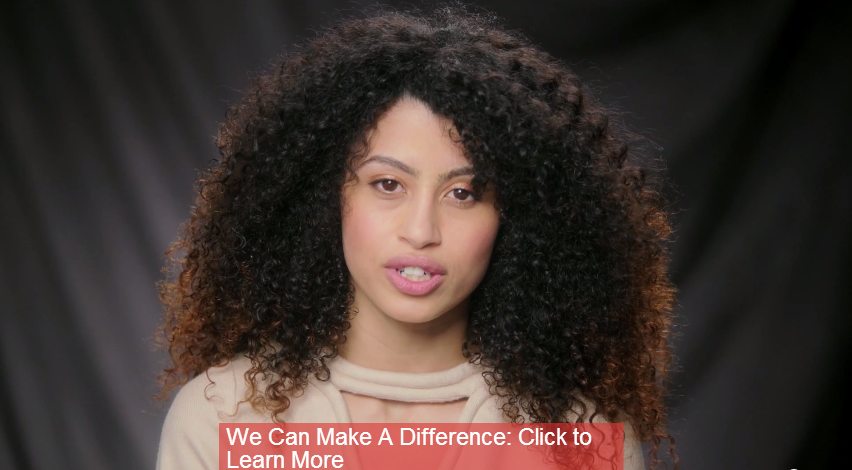
The Save the Children team are on point when applying YouTube optimization strategies. An annotation is placed nearly at the end of the video, centered in the lower third. The red shade brightly contrasts gray/charcoal color palette and backdrop. This annotation serves as an introductory call-to-action before others are offered.
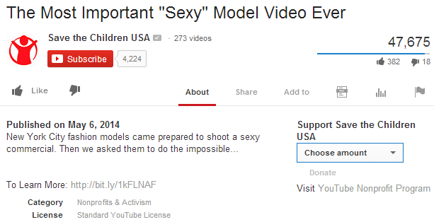
The description is clean and simple with a call-to-action in the fifth line that is still seen above the fold. One perk of YouTube’s nonprofit program is the donate button embedded right next to your description. Viewers have the ability to donate funds directly to the nonprofit! This option is currently only available for organizations based in the US and United Kingdom though I’m guessing a larger roll-out will happen in the future.
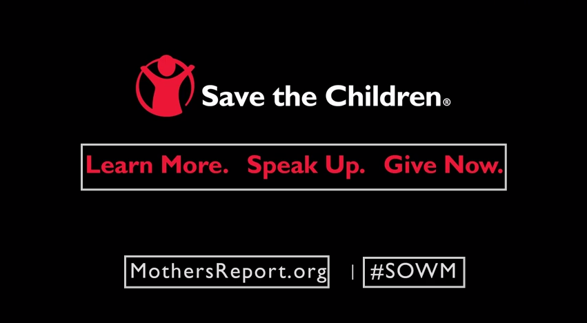
The take home screen features three calls-to-action. The use of red and white contrasting text really stands out compared to the black graphic. Like the earlier annotation, two of these links take viewers to Save the Children’s State of the World’s Mothers site where audiences may experience richer content offers like the actual report and additional videos. Harder calls-to-action are integrated alongside these content offerings such as donation and pledge buttons.
For profit or nonprofit, large or small, local or international, have great content ready to complement your video. That content may be additional videos as part of a series. Perhaps it could be a free e-book on a specialized topic, a case study, a whitepaper, blog posts, or an annual report. Whatever it is, make sure it’s a valuable addition that accomplishes at least two objectives:
- Answers questions and educates
- Provokes more questions and curiosity
Here, you can begin crafting specific valuable content to address tangential questions, map viewer behaviors and consumption patterns, and create a dialogue with your audiences. After all, one piece of your content isn’t likely to be the end-all and be-all of who you are and how you’re beneficial to the person watching.
