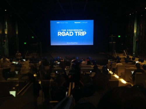
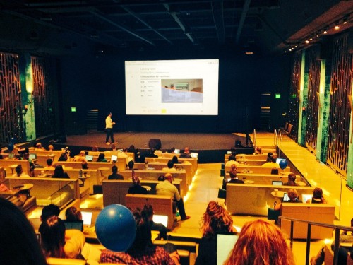
INT. THEATER #1, REVERE HOTEL – AFTERNOON
Hands strike key strokes across a sea of Apple laptops. Small paper bags crunch and crinkle. Gentle conversation is shared at barely a whisper. Enterprising men and women delicately navigate rows of tight seating.
The lights dim. We see the illuminating glow of laptop screens, tablets, and phones.
Conversation stops.
The show begins.
Wistia’s Chris Savage shared dozens of insights – often jaw-dropping – that wowed audiences at the Unbounce Conversion Road Trip in Boston, MA. My poor screenwriting aside, you could hear a palpable excitement as Wistia’s CEO presented a master class in holistically improving an organization’s video marketing strategy.
The Central Conflict
Savage touched upon four foundational challenges that every company experiences when building an agile video marketing strategy. Since you’re well-accustomed to the traditional 4 (or 5, depending on who you ask) P’s of marketing, let’s adjust this perspective for video. The very real struggle was summarized as (emphasis mine):
“How do we make engaging videos (production), put them in the right places (placement), and make sure that they drive action(participation)?”
“What’s the goal of the video(purpose)? After someone watches this video, I want them to ___________”
-
Why would someone care about your video?
-
What do you want them to do?
-
How are you going to make awesome content?
-
Where are your buyer personas in their conversion journey?
-
When will they interact with specific videos you’ve made?
You’ll be re-visiting these questions again and again. Thankfully, Savage articulated a clear plan with several actionable techniques that are quickly implementable. Here are some of his greatest hits:

Tips on Improving Play Rate
Savage defined play rate as “the percentage of people that loaded your page and clicked play on a video.” However, conversion can’t happen if viewers don’t give you an opportunity to start. There needs to be a reason why people feel compelled to watch.
Where should you place a video on your page?
Wistia’s research concluded that play rates suffer a near 50% drop when videos are placed further and further down the page. This advice seems to follow the axiom of keeping videos above the fold. Further research indicated high play rate percentages when videos are 301-450 pixels in height and 401-600 pixels in width.
Fun with Thumbnails
Savage shared some sage advice: videos with custom thumbnails experienced a 35% increase in play rate compared to others. Custom thumbnails serve as a great initial contact point between your brand and potential viewers. Don’t know where to start? Check out YouTube’s Creator Playbook for tips on maximizing each thumbnail.
-
Bright, high-contrast
-
Close-ups of faces
-
Visually compelling imagery
-
Well-framed, good compositions
-
Foreground stands out from background
-
Looks great at both small and large sizes
-
Accurately represents the content
Improving User Engagement
We in the video marketing industry toss around the word “engagement” as some understood, mythic state that is assumed to happen naturally.
Be engaging.
Create engaging content.
In reality, it’s easier said than done. Engagement largely depends on how you deliver value to your audiences in helping them improve their circumstances. In addition, engagement is not guaranteed to be sustained or lasting. We must earn it.
The heading of a particular slide exulted, “Engagement is viewing momentum.”
Chris is right; ask yourself where you want audiences to go and what you want them to do after watching your content. That momentum must be carried. What offers follow?
-
Other complementary videos
-
Blog recaps
-
Tutorials
-
Testimonials
-
Demo requests
-
Case studies & white papers
Imagining engagement at the individual video level, his next section was actually a dissection of video formatting.

The Anatomy of a Video
The structure of a video has three parts: the nose, the body, and the tail. The “nose,” the first 2% of your video, makes your first impression to viewers. A meaningful introduction impacts a viewer’s likelihood to watch the rest. For this and many other reasons, Savage believes “the nose” to be the most important portion of your video. His advice on improving the first section of your video is rightly viewer-centric:
-
Jump right in
-
Hook the audience
-
Impress quickly
Main takeaway: don’t waste time. Give viewers what they came to see. Tracking audience retention data for the first 10 or 15 seconds of your video should indicate your viewers’ tolerance for cutesy intros or extended preambles.
Defined as the middle 96% of a video, the “body” is the main area for conveying value. This is where you articulate your story and why your message benefits for your customers. But, nuances exist in determining how long your video should be and what aesthetics to use depending on its purpose. If you’re stuck, consider:
-
Splitting into parts
-
Change locations and people
-
Add personality
-
Use music for momentum
Splitting works well for long-form videos where a lot of material may be examined. Splitting creates checkpoints and chapters for browsing. What’s the benefit? Viewers are able to quickly find segments most beneficial to them. Tracking re-watch analytics may inspire you to devote new content projects to segments with heightened playback peaks.
The “tail” encompasses the final 2% of your video. Depending on the type of video you produce, the landing can be tricky to master. Here, it’s imperative to preserve that engagement momentum and direct it to your next offer. With this in mind, Savage recommends:
-
Don’t “wrap up”
-
Keep logo/titles super short
-
Beware ending music
“Wrapping up” and “ending music” (one of our guilty pleasures) are subtle psychological cues that imply finality. If you’re stuck on how to conclude your video, try a very quick summary/recap of major takeaways followed by a call-to-action. Your call-to-action may reiterate a previous CTA you expressed earlier in the video or may be a separate/completely different offer. Keep in mind what your buyer personas are looking for and where they are in their conversion journey so that you propose offers most beneficial to their circumstances.
A Route to Get Ahead
Of all the incredible stats presented, one really stood out for action. Research revealed an emerging place for businesses to leverage video: paid landing pages.
Wistia crawled over 375,000 paid landing pages and found that only .25% of these pages featured a video. That’s half of half of one percent!
Now, that’s not to say video landing pages are a walk in the park. Your content, your landing page, and your offer must all be aligned to ensure higher quality scores for your ads. Not sure where to start with landing page videos? Keep this in mind:
-
Articulate how a user benefits from your offer
-
Answer the “search intent”
-
Keep it short
People are looking to solve a problem as fast as possible. Remembering Chris Savage’s advice earlier on the “nose,” start communicating value right away. Focus on addressing the “search intent” or the reason why someone clicked your ad. What is he or she looking to accomplish? What is the ultimate need?
Congruence is key. Your video content should complement everything on your landing page and vice versa. If your landing page sells B2B operations management software, your video needs to relevantly reflect that and not the company picnic footage you uploaded to YouTube 3 years ago.
Thank You
Thank you to Unbounce, Wistia, Chris Savage, and everyone else who made the Conversion Road Trip Boston event so wonderful. I encountered new approaches, gained a more nuanced understanding of many different variables concerning conversion rate optimization, marketing, and consumer psychology, and met so many wonderful people.
Oss.


