Our dear friends, YouTube Annotations, are going on a trip to Belize in the near future. Cards have been introduced as an “evolution” of Annotations according to Muli Salem, YouTube Product Manager. Compatible with mobile tech, YouTube Cards can link to a list of approved merchandising and fundraising sites and landing pages. Cards also feature thumbnail images, short descriptions, and calls-to-action.
h/t Tim Schmoyer & Video Creators
This is just the beginning according to TechCrunch’s Sarah Perez (emphasis mine):
“YouTube notes that over time, the plan is to not only help creators provide this enriched experience to viewers, but it will also optimize the system so that it shows the most relevant teasers and cards to viewers based on viewer’s behavior, performance, and the device viewers are using.”
These beefed up “Annotations 2.0” present a wealth of opportunities for video marketers to drive traffic and accomplish goals. Opportunities involving merchandise sales and crowdfunding will surely appeal to for-profit and non-profit organizations looking to quantify a YouTube marketing ROI.
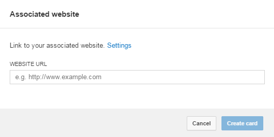
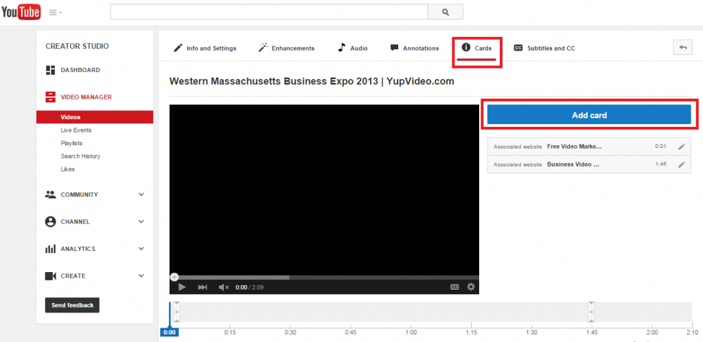
We’ve played around with some of these features. You can access YouTube Cards in the”Video Manager” section of your account. They’re currently listed right next to “Annotations.” Here’s a breakdown for an Associated Website Card:
Associated Website
This is your landing page. Make sure it contains highly relevant language and content pertinent to the video your viewers just watched. It’s a natural extension of the offer and call-to-action. What could you link to?
- About (leadership, recent news, upcoming events)
- Contact page
- Blog(s)
- Case studies
- White paper
- Testimonials / Reviews
- Careers page
Plenty of opportunities exist so long as you connect content with context and intention.
Description / Offer
- 50 characters
- Valuable
- Directed
- Goal-oriented
Your offer should add value to the viewing experience so that the person watching gains something meaningful. Remember, your video marketing needs context. Likewise, your offer needs to be contextually relevant. If your video has TOFU (re: top of the funnel) positioning, consider following up with MOFU offers (e.g. free e-book, case study, advanced series of videos) that turn prospective watchers into qualified leads.
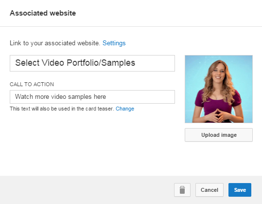
CTA
30 characters equals how much?
The question above marks 30 characters. On one hand, it’s not a lot of real estate to craft a determined call-to-action. On the other hand, you will find a way to articulate a compelling directive. Remember, the count is not set in stone as YouTube may increase or decrease the limit down the road.
So, where to begin?
Your call-to-action must align with your landing page and offer. Think of them as three sides of an equilateral triangle. Your call-to-action needs to reflect the viewer’s location in the buyer’s journey and what he/she stands to gain from your offer. Consider the benefits and disadvantages of using hard or soft calls-to-action.
Utilize actionable language that naturally explains what the viewer needs to do in order to redeem your offer. If you’re a local bank offering a free companion e-book (e.g. “Mortgages 101”) for prospective customers, you might go with “Download your free e-book” or “Learn more about mortgages.” If your viewer just finished watching a testimonial, you might link to a contact page for a free consultation, quote/estimate, or demo.
Some basic examples:
- Learn
- Download
- Find
- Get
- Watch
- See
- Click
- Read
- Buy
- Subscribe
- Donate
- Help
There are tons of clear and concise verbs for application. Of course, language will vary based on your industry. Your keyword research will reveal the lingo and jargon your customers already use and understand. Keep split-testing to see what works best for your content.
Image
This is the visual impression point of your Card. In terms of thumbnails, YouTube’s Creator Playbook recommends images with:
- Clear, high resolution
- Picture quality that’s scalable
- Brightness
- High contrast
- Visually compelling
- Close-ups of faces
- Great compositions
- Identifiable foreground vs. background
- Relevancy and accuracy to content
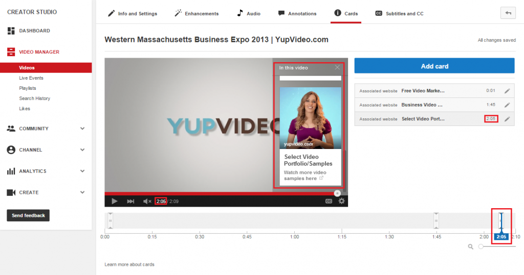
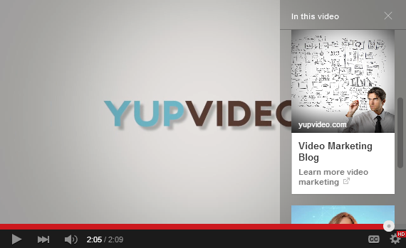
YouTube Card thumbnails are different but many of the same principles apply. Upload custom images for each Card. Make sure these thumbnails are relevant and accurate (re: don’t bait and switch your viewers!) to the offer, call-to-action, and landing page. Keep track of where your Cards appear in your video so that your thumbnails stand out from the color palette and background visuals.
Takeaways
Don’t Go Overboard
YouTube’s Cards feature must be tastefully applied. Content creators are rightly ecstatic about the opportunities to crowdfund, sell merchandise, link to other content, and offsite. However, you have to prioritize the viewing experience. It’s no secret that many viewers despise annotations and their distracting tendencies.
Test!
Content Creators’ Tim Schmoyer notes higher performance in click-through and conversion rates when comparing Cards to Annotations. Though promising, you must test to see what works best for your business.
Looking for a place to start? Try testing:
- When the Card appears (beginning, middle, end of video)
- Card frequency (once in the beginning, once in the middle, once in the end)
- What type of Card excels in that situation (MOFU offer vs. link to a video playlist)
- Thumbnails / Images
- Calls to Action
- Offers
As Sarah Perez and Muli Salem stated earlier, this is just the beginning. YouTube Cards will evolve as more feedback is incorporated. However, they signify a big leap forward for YouTube marketing.

Pingback: 8 Tips for Effective Thank You Page Videos